EDGE
My approach and the result
My approach and the result
After reading the competition form I’ll made my own decisions which result in the style showed.
Process
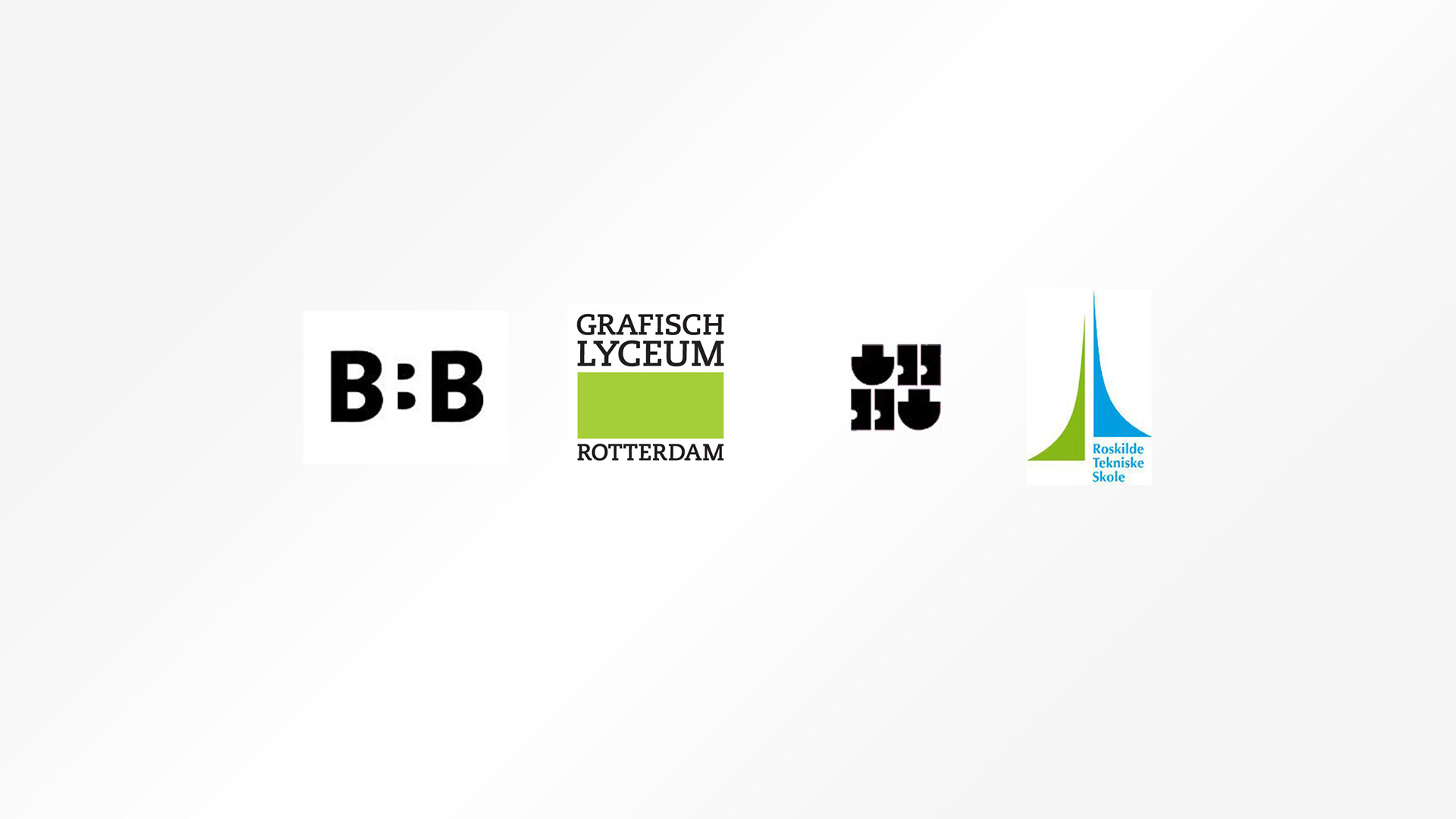
I started with the design contest for EDGE by comparing the logos of the participating schools.
My first thought when I see the four logos is that they are all modern, clean and without everything unnecessary.
Secondly, while I was looking for a color scheme I noticed that the use of color is absolutely minimal.
Furthermore the used typefaces in the four logos are also modern and play a big role in the designs.
So after watching the existing designs I make my own new design, with the following points in mind.
Design points
Process
I started with the design contest for EDGE by comparing the logos of the participating schools.
My first thought when I see the four logos is that they are all modern, clean and without everything unnecessary.
Secondly, while I was looking for a color scheme I noticed that the use of color is absolutely minimal.
Furthermore the used typefaces in the four logos are also modern and play a big role in the designs.
So after watching the existing designs I make my own new design, with the following points in mind.
Design points

Moodboard formed by word association
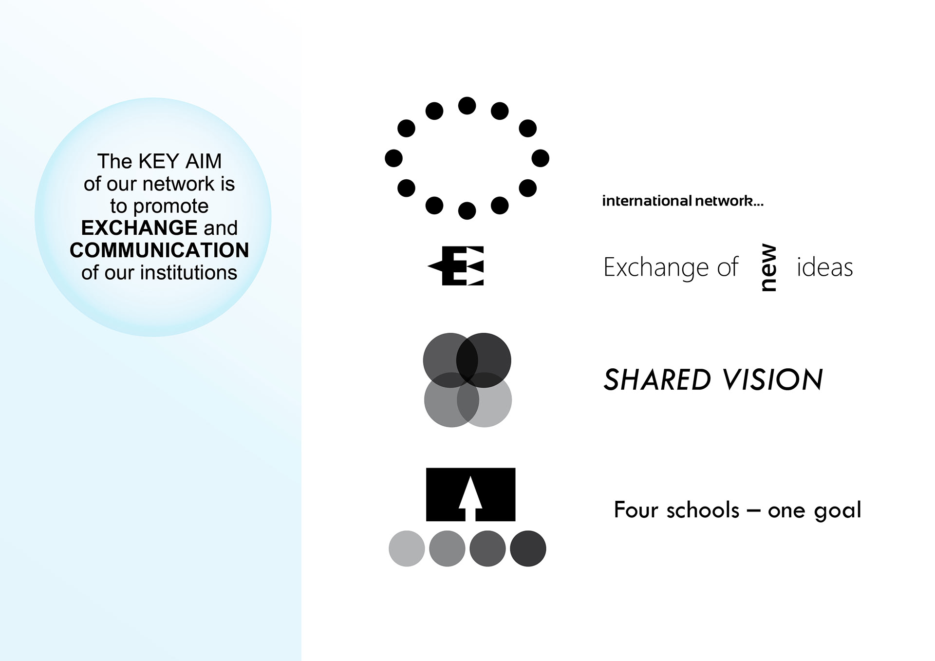
Targets of EDGE with explaining icons
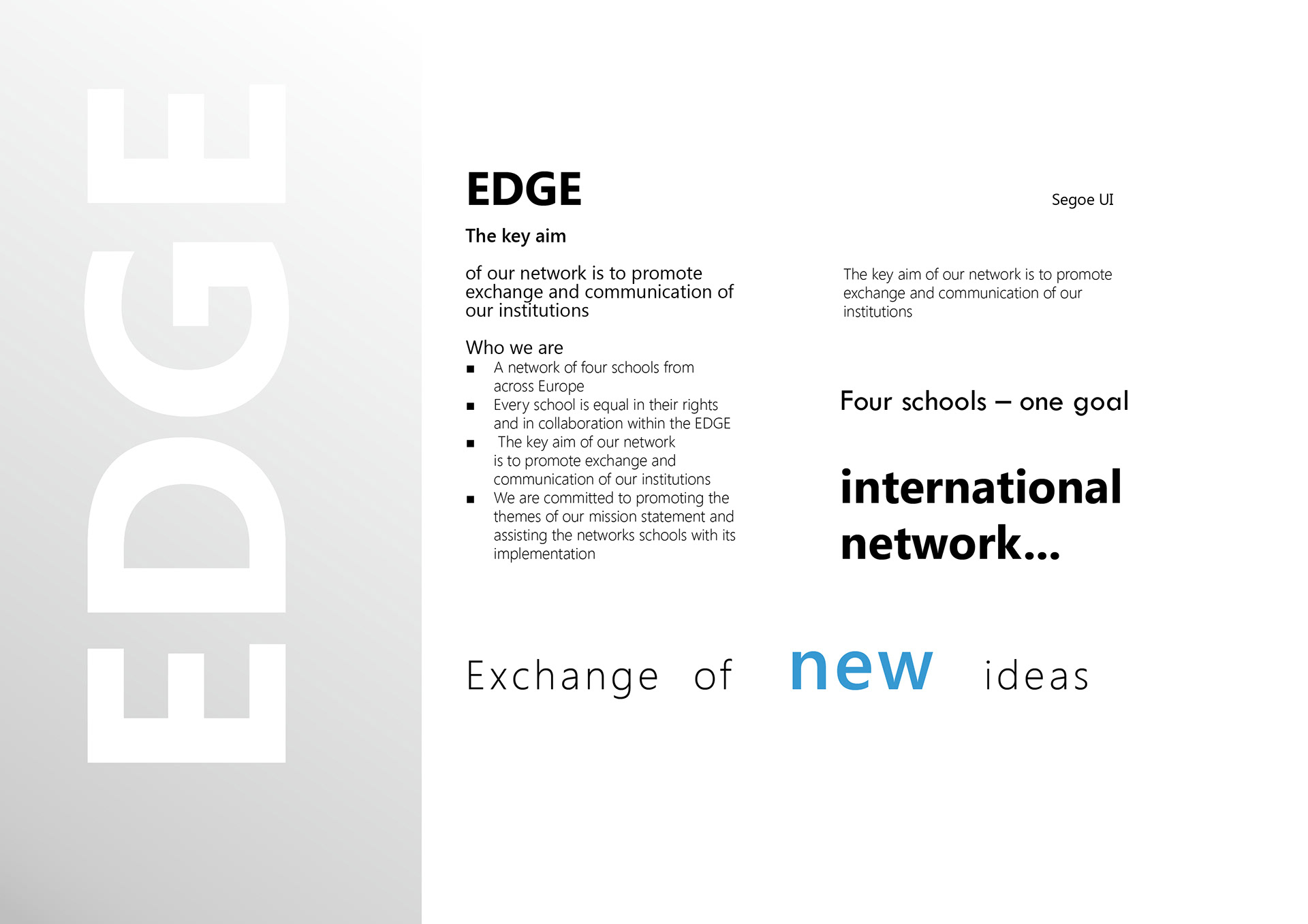
Typography of EDGE
Font used is Segoe UI
Font used is Segoe UI
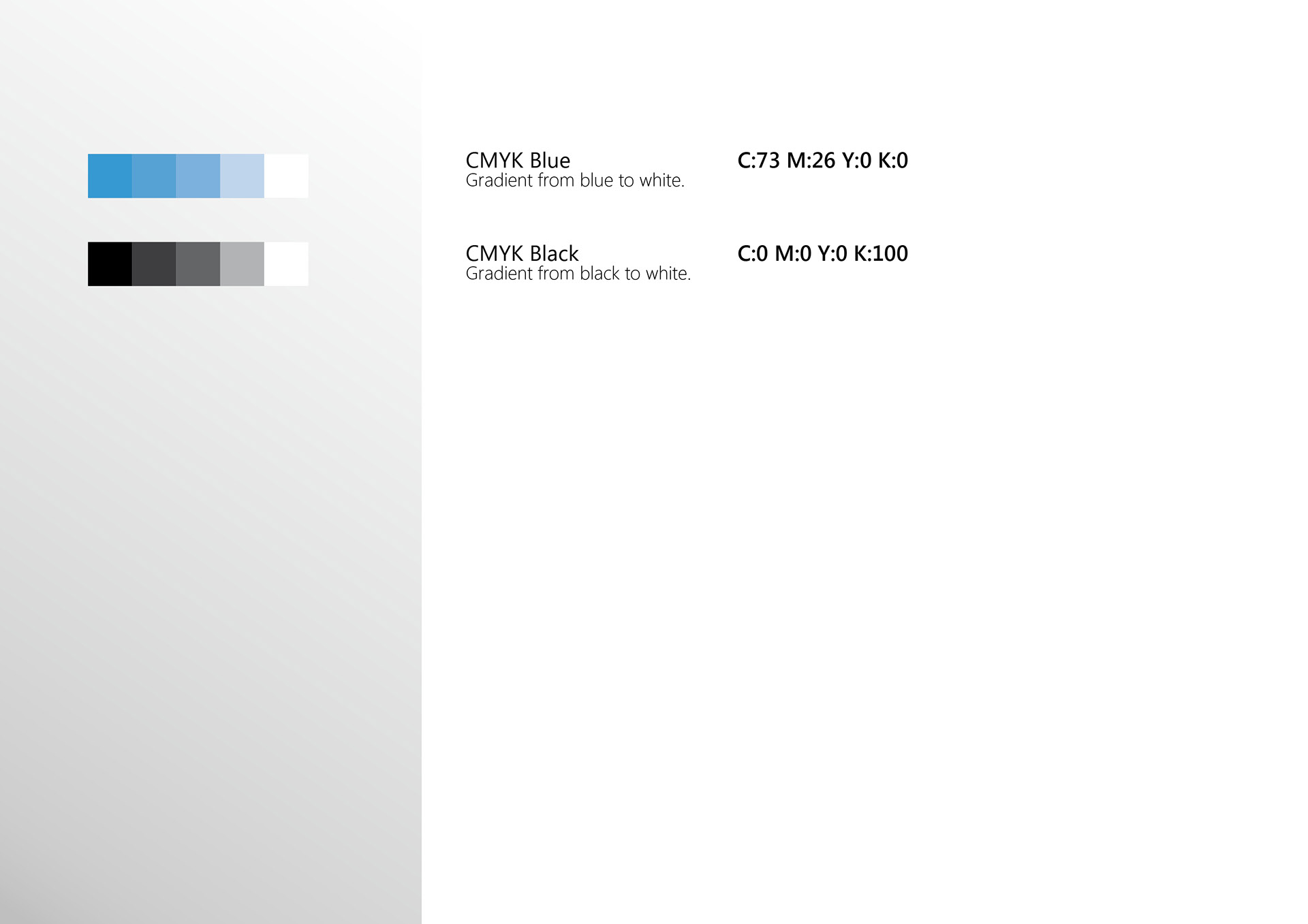
Color combinations of EDGE
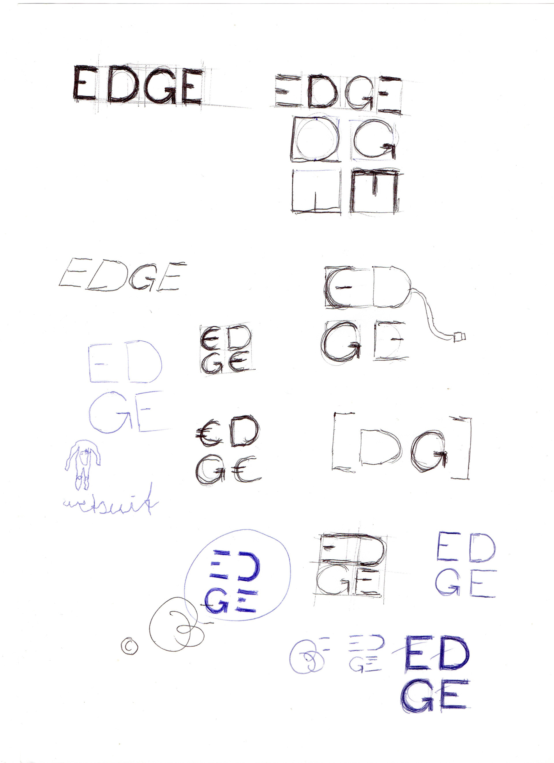
Handdrawn logo sketches
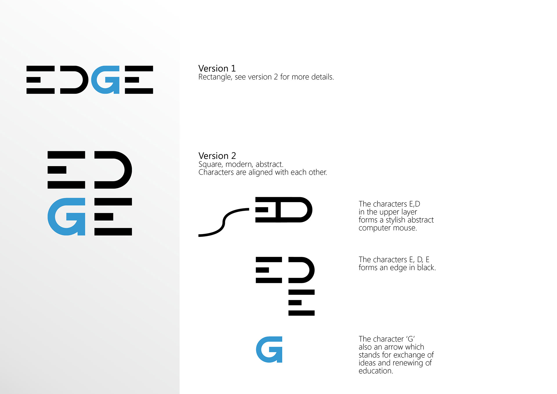
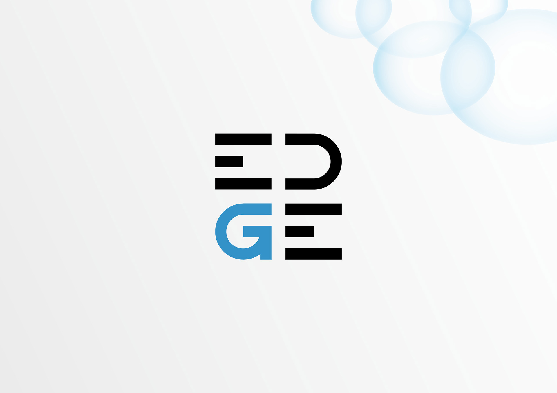
2 Logo design versions
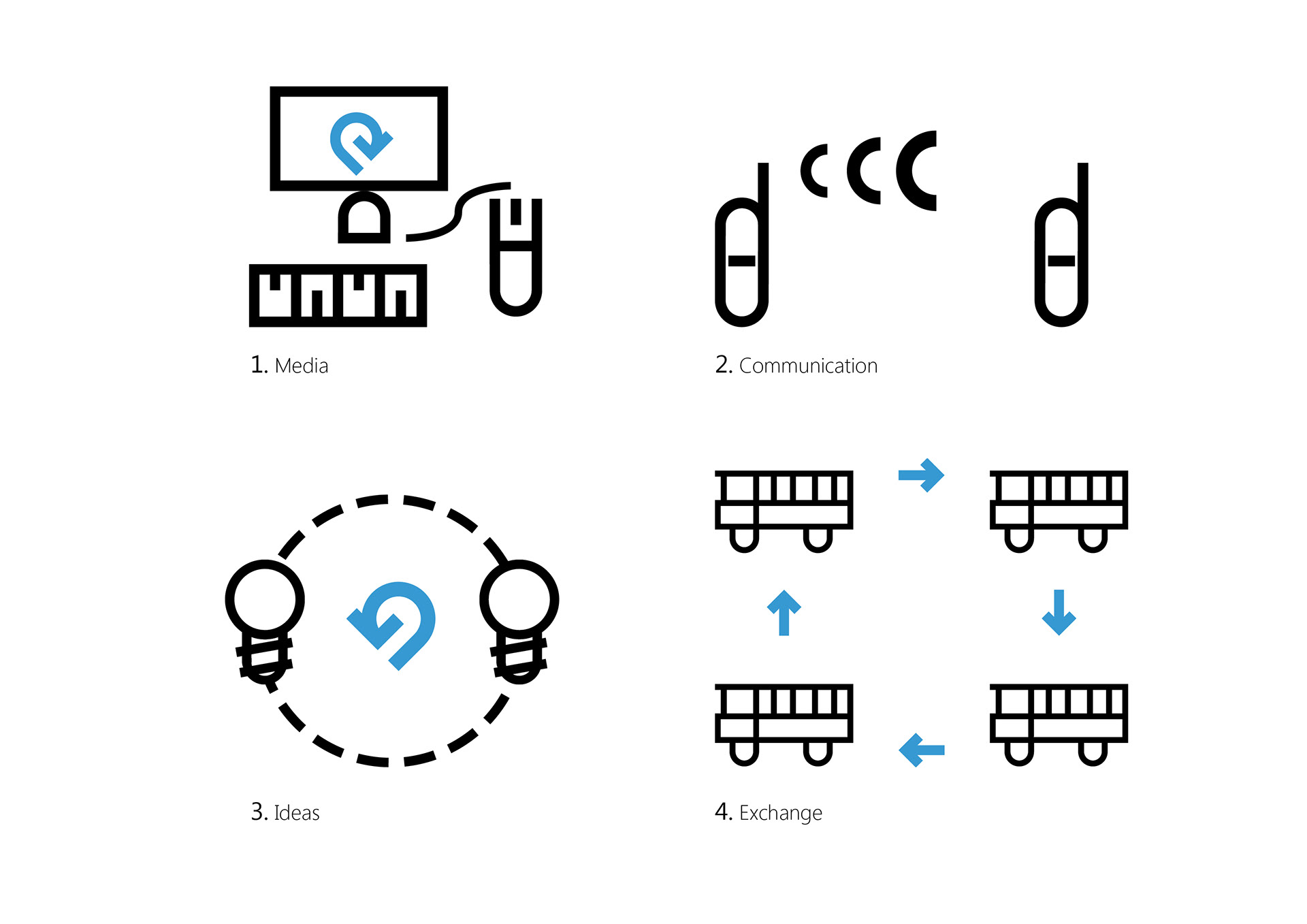
Visual language of EDGE based on logo
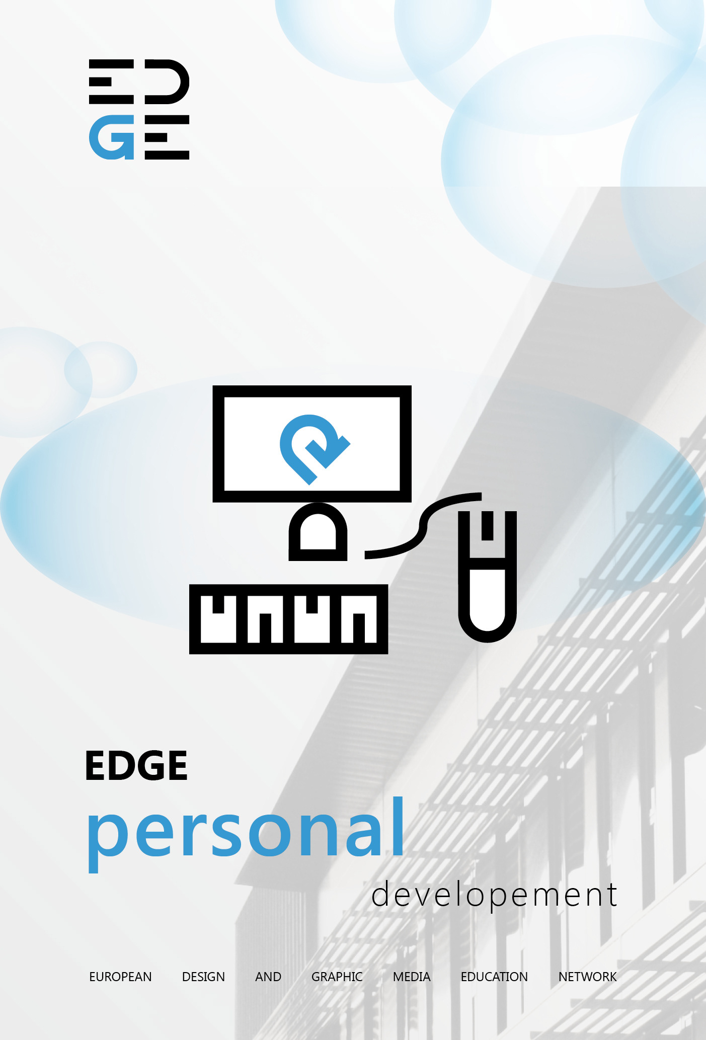
1. Media
Computer, made of forms from the logo. Four schools - one goal. Developement.
2. Communication
Mobile phones connecting. Up to date communication sharing the latest trends in education. Shared vision.
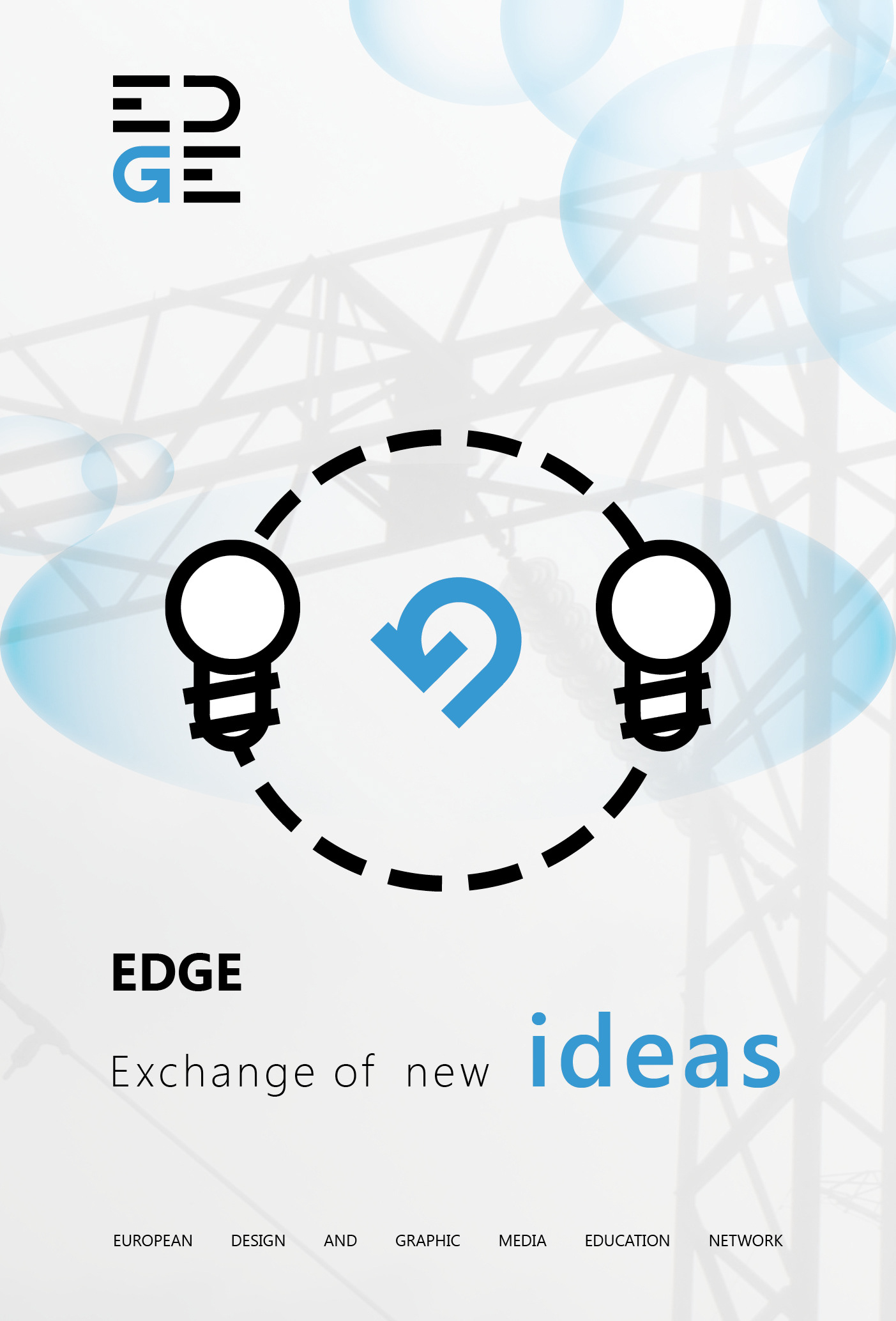
3. Ideas
Light bulbs turning. Exchange of ideas, innovation and knowledge in design and tecnique to support the development of each others schools.
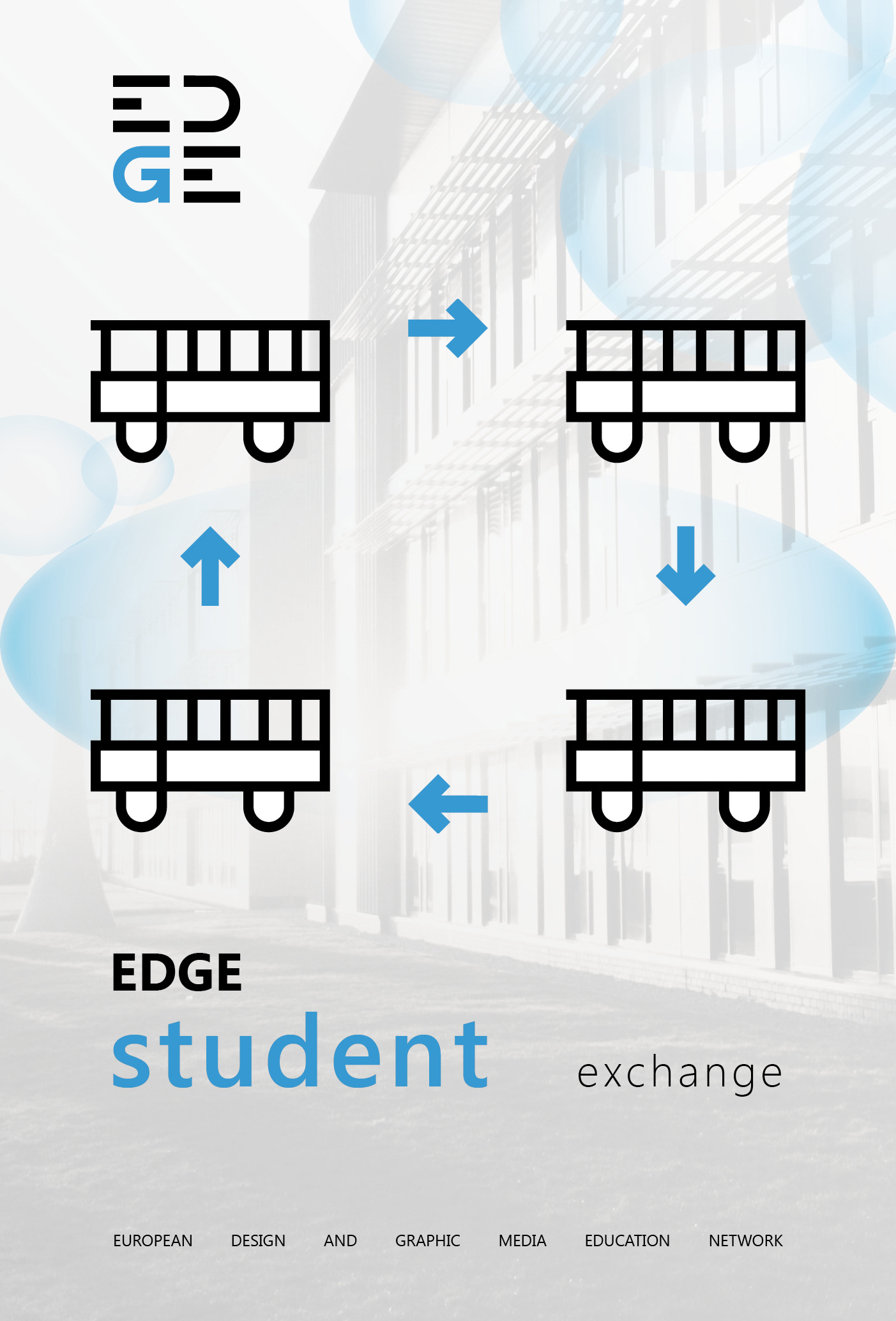
4. Exchange
Busses, stands each for one school. Student exchange, International network, Internship opportunities encouraging for european collaboration and students personal growth.
3 Poster designs based on icons that are derived from the logo.

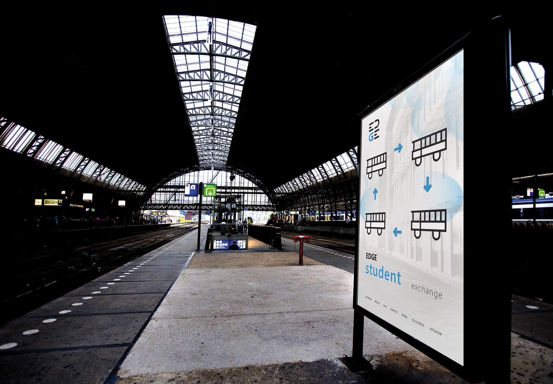

Posters applied in environment

Website
http://www.edge-edu.eu
Thanks for watching,
I hope you enjoyed it!
This work was done in a competition as a 4th year student graphic design at the Grafisch Lyceum Rotterdam. (the logo you saw at the four schools)